Bell Curve Graph: How to Read the Bell-Shaped Curve, Standard Deviation and Percentages
All phenomena tend to concentrate around the average and become rarer the farther away they are from it. And this single concept gives you the shape you recognize well and allows you to translate a set of numbers into the probabilities. In this article, we'll talk about the shape itself, some basic statistics concepts related to it, and the misleading way it could be applied in financial markets.

What Is a Bell Curve — Definition
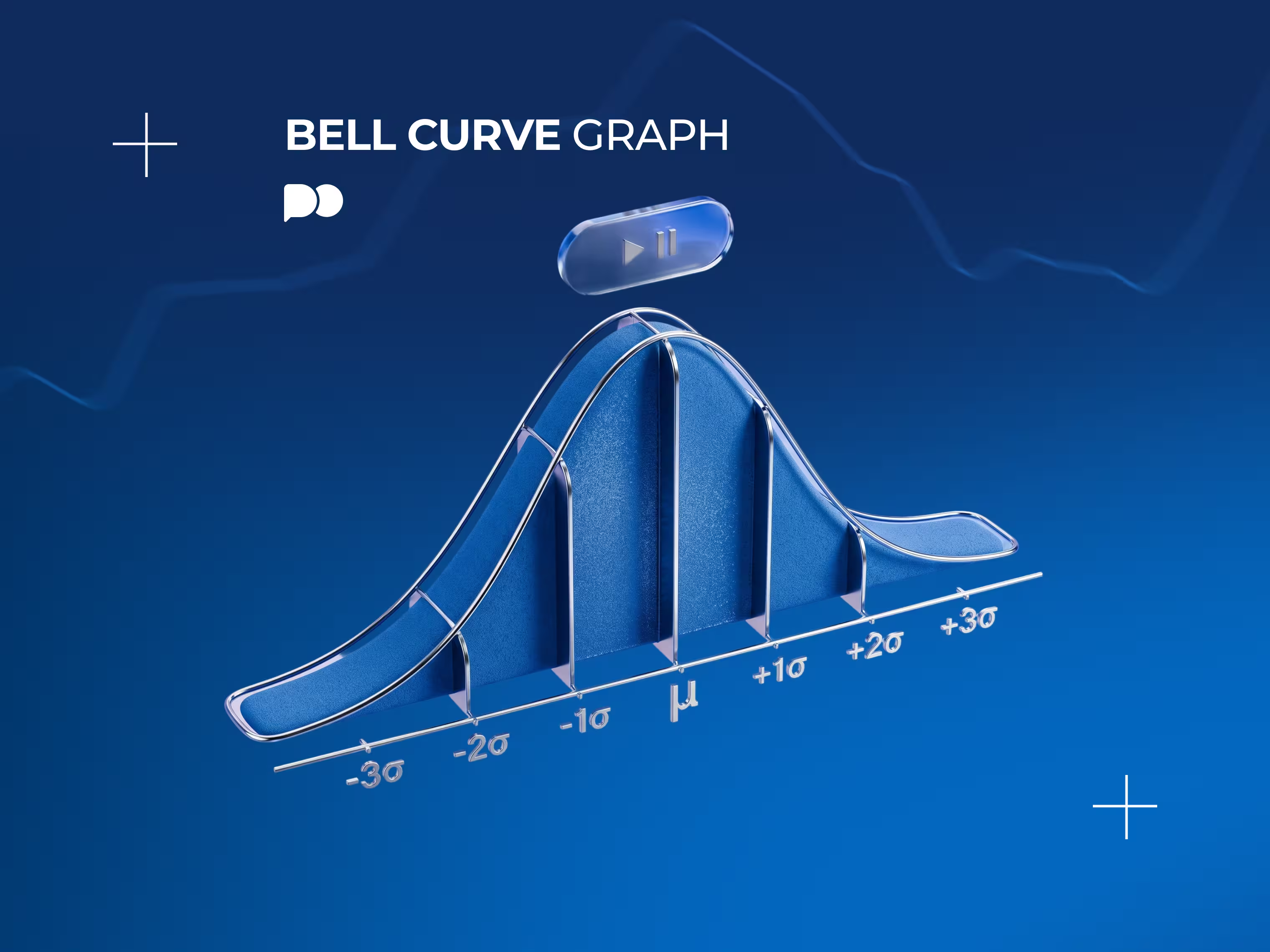
A bell curve graph illustrates how often each value of a dataset is observed. Values near the average are very frequent, hence, the middle portion of the graph is high. Values far from the average are rare, hence, the graph tends to decrease toward the ends. Draw it and you'll see the shape which resembles a bell and got its name from that fact.
Its official name is the normal distribution curve and there are three properties which make it special. First, it is symmetric: the left half is a mirror reflection of the right one. Second, the mean, the median and the mode all coincide and are equal to the center point of the shape. Third, the tails are infinitely approaching zero but never reaching it, meaning that no value is impossible.
Two numbers are sufficient to fully define the shape: the mean establishes the center point and the standard deviation defines how wide it is. If the standard deviation is small, then all the values will be close to the mean, and therefore, the graph will be tall and thin. If the standard deviation is large, then the graph will be broad and flat.
Why Many Real-World Variables Follow This Shape
The shape appears over and over again due to a reason, not coincidentally.
When several independent causes act together to produce some effect, it is found that the bell shaped distribution tends to arise, regardless of the nature of these factors. This phenomenon is referred to as the central limit theorem.
Distribution of heights of the members of a particular population due to the effect of many random genes and environmental factors.
Errors in measurements of physical experiments because small inaccuracies result in values slightly above and below the true value.
Manufacturing tolerances because of the tendency of parts to concentrate around the specified value and rare occurrences of extreme ones.
Scores on exams taken by a large sample of students, which is where the concept of grading on a curve comes from.
Returns on a broad stock market index which approximate the shape well enough for many models to work.
But the last example has an important caveat that deserves its own separate section a little bit later in the article. Returns of a financial market look normal in the middle but behave completely differently at the ends, and this distinction resulted in a significant loss of capital.
The Empirical Rule — 68%, 95%, 99.7%
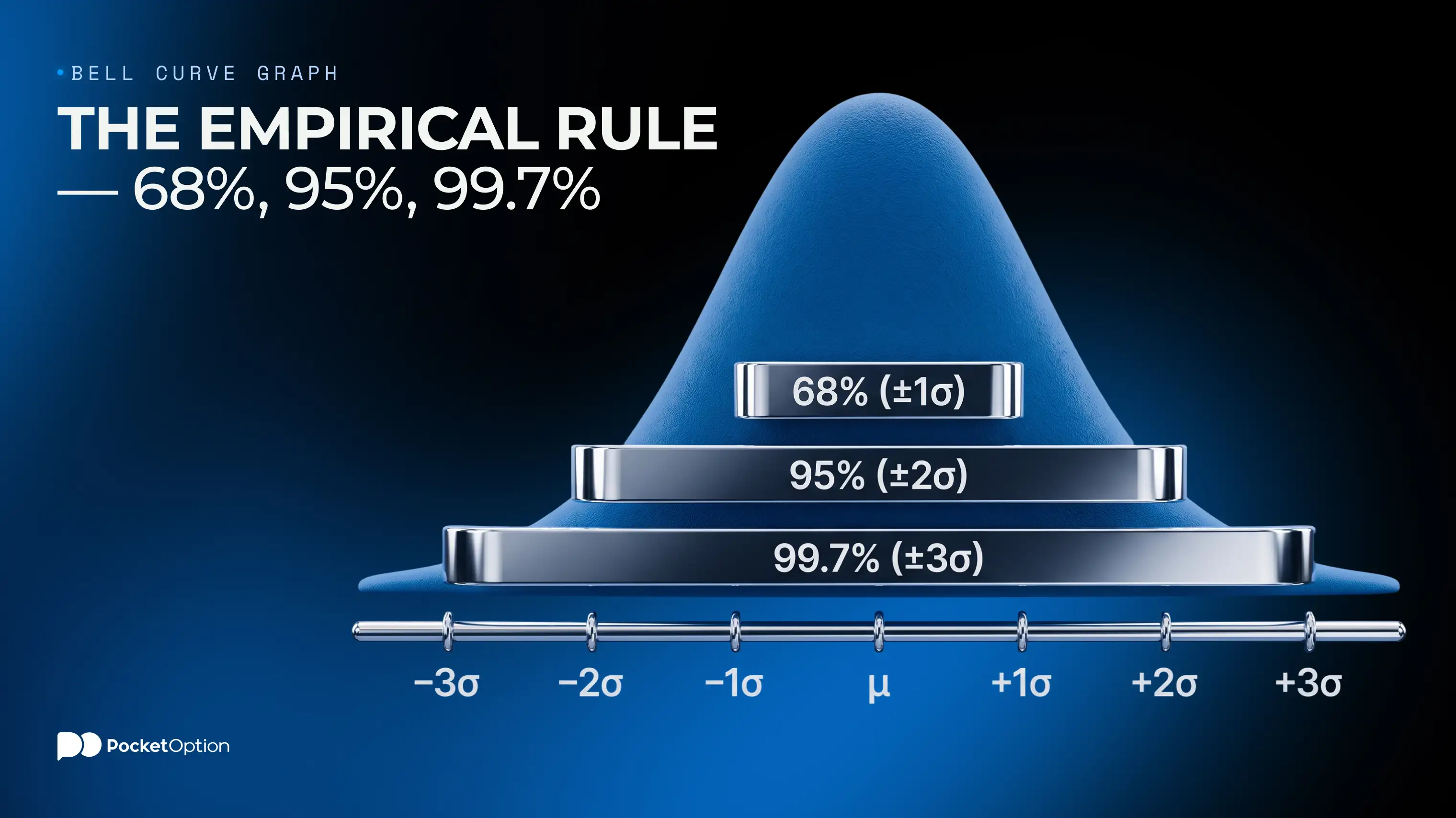
This is the part that is worth remembering, because it allows you to convert the shape into numbers. For any normal distribution, the proportion of the values falling within a certain distance from the average is always the same.
Interval | Proportion of values | Roughly how often the values are found outside this interval |
|---|---|---|
Within 1 standard deviation | About 68% | About 1 out of 3 values |
Within 2 standard deviations | About 95% | About 1 out of 20 values |
Within 3 standard deviations | About 99.7% | About 1 out of 370 values |
These bell curve percentages are constant for any type of normally distributed dataset. Heights of people, scores on the exams, returns on stocks, manufacturing tolerances: if the data is normally distributed, approximately 68% fall within 1 standard deviation from the average and 95% fall within 2.
Interpretation of a bell curve with standard deviations becomes straightforward once you remember it. The marks partition the area under the curve into parts whose sizes you know. The area under the curve is the probability and a value falling between 1 and 2 standard deviations from the average occupies a part where approximately 13.5% of all values fall. Hence, the probability of finding such a value is about 13.5%.
And this is the point when people forget about the significance of the third row. Three standard deviations sound like something extraordinary, but it occurs only once in 370 readings. In daily market readings, it takes place around once per one and a half year.
The Z-Score Formula
The empirical rule applies at whole-numbered standard deviations. The Z-score allows you to find the same probability at any distance from the average.
The formula is simple: Z = (x − μ) / σ. Here x is the value you're interested in, μ is the average of the dataset and σ is its standard deviation. And what you get is the number of standard deviations this value is from the average. A Z-score of 0 means that the value is equal to the average. A Z-score of 1 means that it is 1 standard deviation above the average. And a negative score means that it is below the average, hence, a Z-score of −2 means that the value is 2 standard deviations below the average. The sign indicates the direction and the number indicates the distance from the average.
The main benefit of it is that Z-scores are comparable across different datasets which use different units. A student scoring two standard deviations above the average and a stock rising two standard deviations above the average are, statistically, equal events. That's what standardization means.
A Worked Example
Suppose you've been measuring the daily returns of an asset over a significant period of time and found that the average daily return is 0.05% with the standard deviation of 1.2%.
Today the asset gained 2.8%. Is it a significant change? Calculate the Z-score. Subtract the average from this value: 2.8 minus 0.05 equals 2.75. Now divide the result by the standard deviation: 2.75 divided by 1.2 is equal to the Z-score of approximately 2.29.
This means that today's move is approximately 2.3 standard deviations above the average move. You know from the empirical rule that 95% of the values fall within 2 standard deviations, thus, this move is beyond this interval. A more accurate probability calculation with the help of standard normal table gives a result of approximately 1.1% of all values being above this level.
In other words, you would have expected such a strategy to be used once in 90 days of trading, assuming that there was a normally distributed return pattern. Every quarter, basically. Rare, yes, but possible.
Let's reverse it now. An increase of 6% of the same asset gives us a Z-score of about 4.96, and this means that under the assumption of normally distributed returns, the probability of such a move is approximately 1 in several million observations. The markets produce such moves considerably more often than that, and this is the issue that is discussed a little bit later.
Put the numbers on the chart.
Get StartedHow to Read a Bell Curve in Practice
The knowledge of how to read a bell curve reduces to answering the following two questions which can be answered just by looking at the same graph. How probable is a certain event and is this particular observation rare enough to investigate?
Estimating probabilities
The area under the curve between any two points is the proportion of all the observations that fall within this interval. This is the whole trick of it. The total area is equal to 1 (100%), and any slice of it is the probability of falling within this slice.
Hence, a value between the average and 1 standard deviation from it falls into a slice that contains about 34% of the data. A value between 1 and 2 standard deviations falls into a slice of about 13.5%. A value beyond 2 standard deviations in either direction falls into about 2.35%. These numbers are derived simply by dividing the empirical rule in two because of the symmetry of the bell shaped curve.
Spotting outliers
The usual practice in most fields is to consider any value beyond 2 standard deviations from the average suspicious and any value beyond 3 an outlier. Both figures are not universal rules and are chosen just because they correspond to convenient probabilities.
What really matters here is to investigate the reason why the observation is an outlier. The observation 5 standard deviations from the average has 3 possible explanations and only 1 of them is interesting. Either something unusual happened, or the measurement is wrong, or your assumption that the data is normally distributed is incorrect.
In financial markets the last case is the most common one, and ignoring it is what leads to the models' failure.
Using the Bell Curve to Think About Risk
The link with trading is obvious. If you know the average return on your position and how much it can vary, the standard deviation bell curve helps you to think about the range of reasonable outcomes rather than making a single guess.
Volatility is what the standard deviation measures. The higher the volatility of the asset, the flatter and wider the curve is, meaning that large moves in both directions are relatively common. The lower the volatility, the taller and narrower the curve is, meaning that most days are similar to the average one. It is the same shape with a difference in the width, and the width is the risk.
This is the logic of the position sizing. If the typical daily move of an asset is 1.2% and you've sized the position in a way that a 3% move against you would be painful, you've created something that would hurt you once a quarter. Calculating this beforehand is much more useful than experiencing it in real time.
The formalized version of this thinking is called Value at Risk and uses the distribution to estimate the loss a portfolio might suffer over a certain period of time at a given confidence level. There is an explanation of this in the article on how traders estimate potential portfolio loss with VaR, and it is worth reading along with the limitations that are described next.
Why Real Markets Often Show "Fat Tails"
Here's the truth. The returns of the financial markets are not normally distributed, and this difference is extremely important.
If you put the actual daily returns on a bell shaped graph, the middle part will look fine. Most days are close to the average, the shape looks symmetric and similar to the expected. But it breaks down at the ends. The extreme moves occur much more frequently than any normal distribution would predict and this phenomenon is called fat tails.
The scale of the difference is enormous. On October 19, 1987, the S&P 500 fell over 20% during a single session. Under the assumption of the normally distributed daily returns, this move is so unlikely that it would be expected to occur once in the period that is much longer than the age of the universe. And yet it happened, and such moves happened since then.
There are several reasons for that:
Volatility tends to cluster rather than remain constant. Periods of low volatility tend to follow each other, and high volatility periods do the same. Central limit theorem doesn't take it into account.
Participants in the markets influence each other rather than act independently, hence, the assumptions of the central limit theorem are violated precisely when it really matters.
Leverage increases the selling pressure. Positions are liquidated due to price changes rather than opinions, which increases the moves already underway.
Liquidity is withdrawn under stress. Buyers who would usually absorb the selling disappear when they are needed most.
This pattern is especially evident in new and illiquid markets. Application of the same principles to the cryptocurrency market produces much fatter tails than the stock market. This is explained in the guide to controlling risk when trading cryptocurrencies.
What This Means for Trading Models Like VaR
This does not mean that statistics is useless. It means that a particular assumption used in certain models is unreliable, which is a narrower and easier to deal with problem.
Value at Risk, in its simplest form, assumes that returns are normally distributed and gives you a number like 99% one-day. Read carefully, this doesn't say anything at all about the remaining 1%. It tells you the threshold you're expected to cross once in 100 days, and doesn't say how bad it gets after crossing it. This is precisely where the losses happen.
The adjustments for this situation are pretty easy. Take the results of any model as rough guidance, not as precise estimation. Assume that the tails are fatter than the model says because they are empirically. Size the positions in a way that the move several times larger than the model considers reasonable would still be bearable.
The historical example that is worth learning from is Long-Term Capital Management, a hedge fund run partly by Nobel prize winners whose models considered the 1998 losses as effectively impossible. The fund lost the majority of its capital in a few months and required a coordinated intervention to be unwound. The math wasn't wrong. The underlying assumption was.
It is also worth noting that the fat tails are produced, among other reasons, due to the human behavior under stress, and this aspect is covered in the guide on why traders dump positions at the worst possible moment.
The important lesson here is not to give up hope. A bell shape graph is still a good description of the normal conditions and a terrible description of extraordinary ones, and knowing which regime you're in is more important than the precision of any particular number.
Conclusion
Assume that the tails are fatter than your model says and size your positions accordingly.
All other things stated in this essay are mere background to this particular change. The bell curve, empirical rule, and Z-score are useful tools that are applicable within normal situations. They are applicable almost everywhere except the point of risk and do not offer anything else in terms of precise mathematics. This problem is the result of the underlying assumption and cannot be solved via any other mathematical calculations. You should be prepared for movements your model does not expect you to see as they happen frequently enough.
Disclaimer: Trading involves the risks of substantial losses and is not for everyone. Models explain past price action and do not forecast future prices; no risk management can guarantee loss prevention.
Daha fazlasını gör:Knowledge baseTrading