How to Read Pocket Option Charts
A chart is a record of what happened to the price and when it happened. Everything that you add to a chart after this is optional. In this article, we are going to explain what you will find on Pocket Option trading charts, which tools you should start using early, and how to develop a habit of analyzing charts without exploding them into 40 indicators by week three.

What You See on Pocket Option Charts
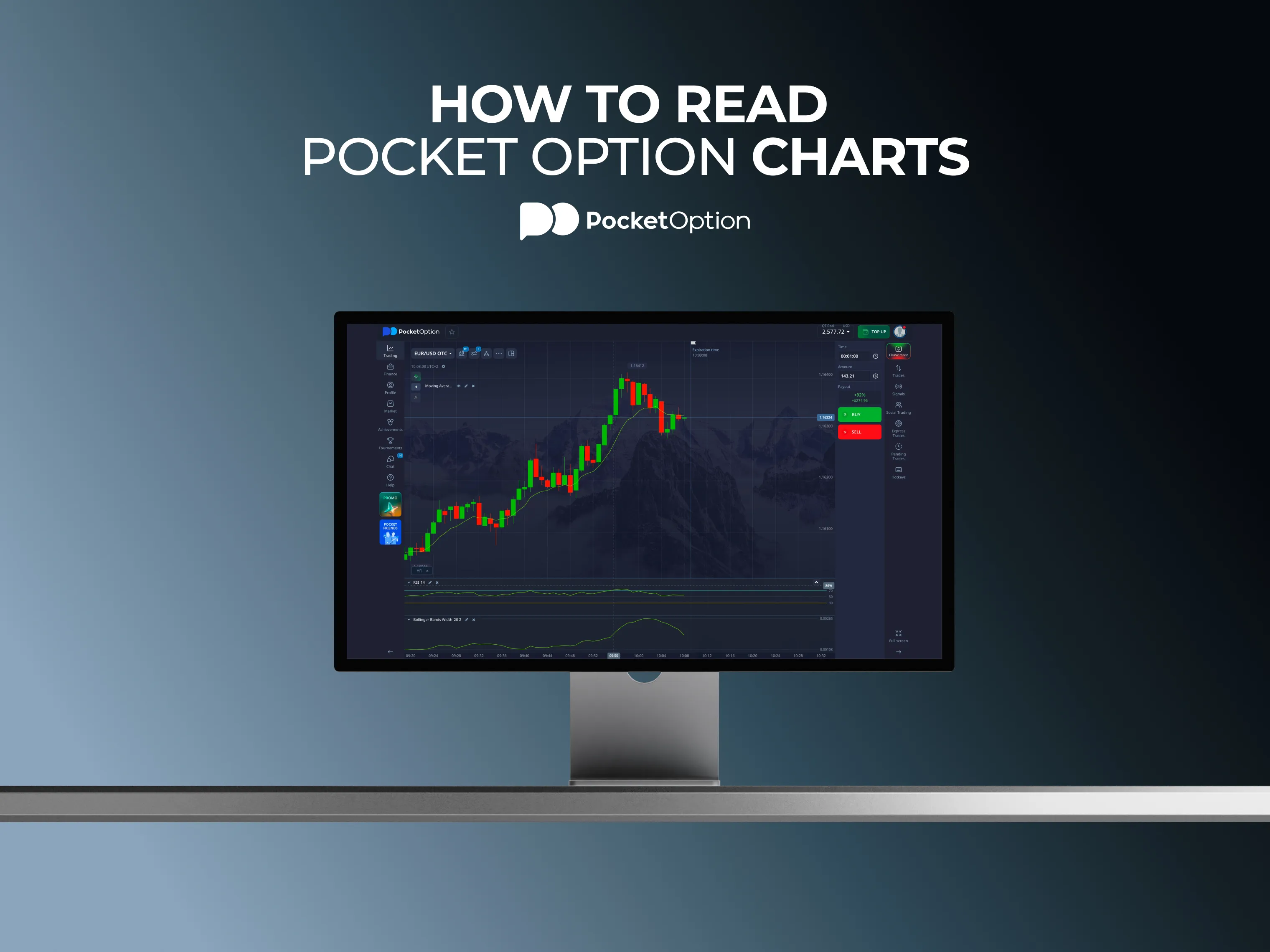
If you open any asset on the trading terminal, the chart layout will be the same. Price runs in the middle, time at the bottom, and controls appear at the top of the chart.
There are five major elements at the top of any Pocket Option chart that cover almost everything you can use in the course of your trading activities. It's a timeframe selector, a chart type selector, an indicator menu with over thirty indicators, tools to draw (trend lines, Fibonacci, and rectangles), and a multi-chart button to split a screen into two or four trading charts at once.
Using the multi-chart option is something you should know about from the very beginning. If you are going to trade several currency pairs, the ability to see them simultaneously without changing anything on the chart is quite valuable, especially when you trade in multiple sessions. The multi-chart option is placed right next to the platform's logo. You can also use separate browser tabs for each chart instead.
That's the entire interface. Pocket Option trading platform charts have nothing hidden in the menu and this is both an advantage for beginners and a limitation in case you need something that the platform doesn't have.
Chart Types: Candlestick, Line, Area, and More
There are four types of charts and they differ in their layout only. No type of a chart is more accurate than another one. All of them provide answers for different questions.
Chart type | What it shows | When it helps |
Candles | Open, close, high and low for each interval, with a colored body and wicks | Patterns, sentiment, and reversals |
Bars | The same four prices, drawn as a vertical line with two ticks | Price structure without the visual weight of candles |
Line | A tick-based line following price in real time | Quick read on direction and momentum |
Heikin Ashi | Averaged candles that smooth out noise | Trend following without being affected by every wobble |
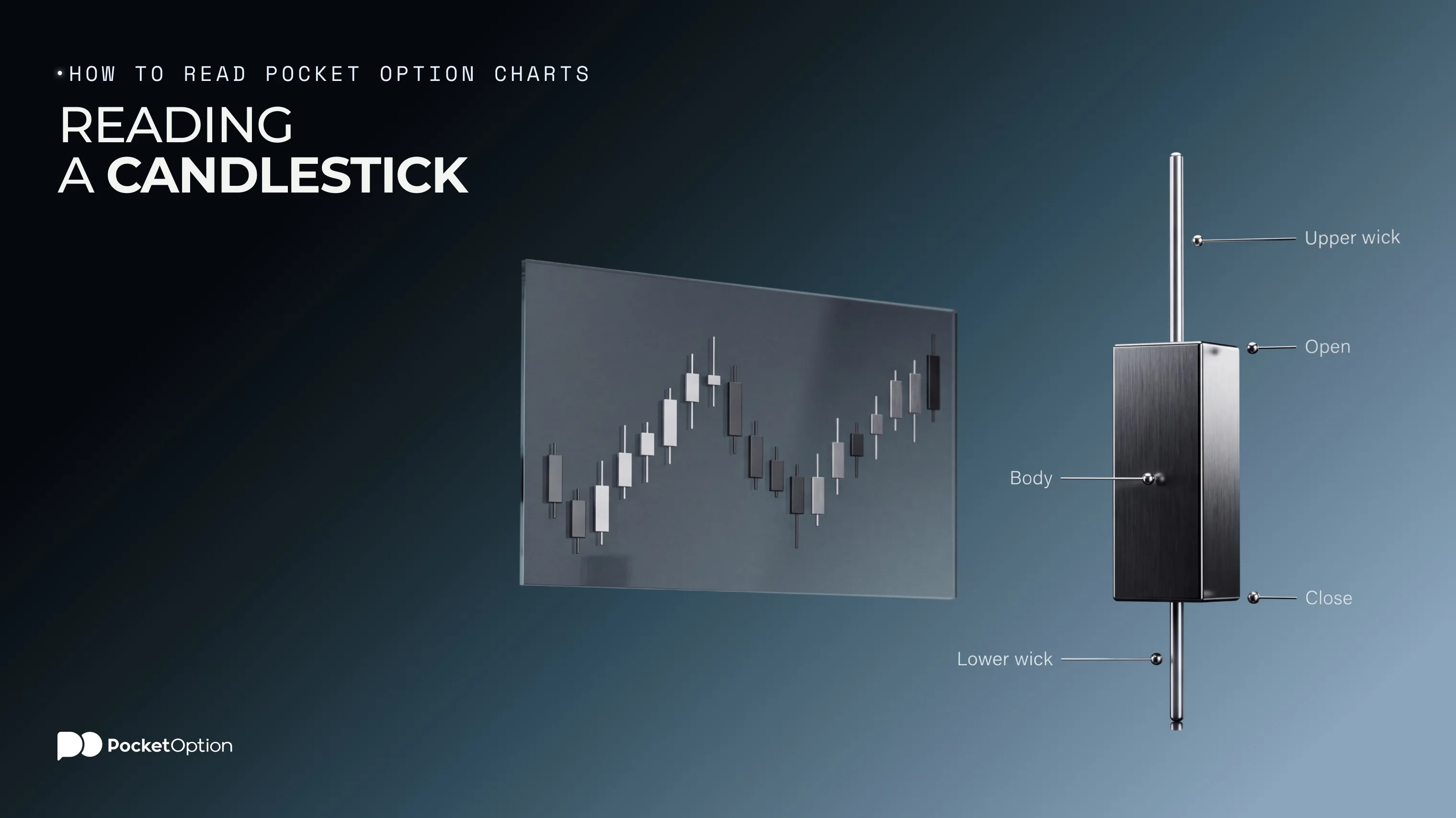
Candles are the chart of choice for most people and for good reasons. Each candle has four pieces of information: open, close, high, and low of the interval, and the body colors show whether the candle closes higher or lower. That's basically all there is to candlestick charts explained in one paragraph.
The Line chart works differently. It's a tick-based chart that follows price in real time, so if you zoom in on it, you will be able to see several ticks per second. There is an area setting that fills the space beneath the line, which some traders find easier to look at. Of course, it won't show you open or close prices, so this chart type is not very helpful when it comes to patterns.
It's also important to mention Heikin Ashi. It uses averaging for smoothing and shows a trend clearly, but keep in mind that it doesn't show the real price that is traded at the moment.
$50,000 in virtual funds, no deposit needed.
Try DemoTimeframes and Session Views
The timeframe selector runs from five seconds to one month, and most beginners won't need half of the options in it.
Trading chart timeframes serve as a zoom control, so a one-minute chart is great to analyze the last hours, while a daily chart will give you a glance at the last months and will hide all the intra-day details. None of them is more accurate and the question is which timeframe corresponds to your holding period.
Here is a quick guide to the selection of timeframes, but remember that it's very rough and shouldn't be taken literally:
Holding period | Timeframe |
Minutes | 1 to 5 minutes |
Hours | 15 to 60 minutes |
Days | 4-hour, daily |
Trading on a one-minute chart while thinking in terms of weeks is one of the ways to confuse yourself. You need to understand the idea: you should choose a timeframe that corresponds to the period of time you are going to stay in a certain position.
What you need to develop as a habit as soon as possible is to look at two timeframes instead of one. First, look at the higher timeframe to get an idea about the trend and then proceed to the working timeframe to place your trades. It will take just ten seconds of additional time and will help you to avoid trading against the big picture trend.
Session timing is also something to keep in mind. The same asset will show different behavior during the Asian session and when London opens, and a chart that seems flat for one hour can become active in three hours. Observe your chosen asset for a whole day before considering it calm.
Basic Indicators and Drawing Tools
More than thirty indicators are waiting in the menu of Pocket Option charts. You will need two, maybe three.
An optimal set of technical indicators for beginners is one tool from each of three major groups. This way you'll avoid choosing three indicators of the same type:
Trend: Moving average is the usual choice, since it indicates that the price is above the moving average when the market is trending up and below it, when it's trending down.
Momentum: RSI is a tool to measure it and show stretched conditions on the scale from 0 to 100. You can find a detailed guide on using RSI for day trading with the settings explained.
Volatility: Bollinger Bands expand in case of high volatility and shrink in case of low volatility.
Volatility and momentum indicators often contradict each other and it's useful in most of cases, since two indicators measuring the same thing will be similar and will not bring much information. An overview of the most popular indicators on Pocket Option covers what else is available in the menu.
Drawing tools are also very useful for traders and most people underestimate them. Marking support and resistance on charts, meaning the obvious levels where the price stops and changes direction, will give you an insight that no indicator can provide. Trend lines and channels are used in a similar way in case you trade in a trending market instead of a ranging one. They are just lines that you draw manually and can be more valuable than a fourth indicator.
Also, you can create templates for your charts, change the candle size and spacing, change the theme of a chart to light or dark, and set price alerts on the levels you need. Price alerts are underrated because they allow you to get away from the screen.
How to Read Pocket Option Charts Step by Step
A quick sequence that takes less than a minute with practice:
Choose an asset and set the chart to candles. Start with it and change it if you need.
Select a proper timeframe that corresponds to your holding period.
Zoom out first. Look at the last several days before looking at the last several candles.
Mark the obvious levels where the price stalls or changes direction. Two or three lines are enough.
Understand the trend direction. Higher lows and higher highs indicate an uptrend, lower lows and lower highs indicate a downtrend, and if the price oscillates around the same levels, it ranges.
Use one or two indicators to confirm your thoughts on the trend, don't use indicators to form your thoughts.
Switch to a smaller timeframe and enter the trade, keeping in mind the higher timeframe.
Step three is skipped most of the times and is the most important one. Price action basics are based on the context: the same candle means different things depending on the fact that it appears on the level where the price stalls several times or in the middle of nowhere.
Note that you use indicators on the sixth step, not the first one. It's important to understand that reading the structure of the chart and using indicators to confirm your findings gives you better results than opening the indicators menu and trying to find a signal.
Does Pocket Option Use TradingView Charts?
No, Pocket Option uses its own charts, not the TradingView ones. It's important to clarify this issue because a lot of tutorials claim the opposite, and the question does Pocket Option use TradingView charts comes up constantly for that reason.
TradingView is a separate platform for analysis with its own scripting language, community-developed indicators, and social component. Pocket Option is the platform where you execute your trades. So the comparison that people do is about a separate analysis platform and charts of a trading platform. The separate analysis tool wins due to its depth, of course.
Pocket Option provides all of the features you need in one platform. The chart that you analyze and the trade you place are in one window with no need for switching apps at the moment of trade execution. Short expiries make this convenience quite valuable.
Some experienced traders prefer to analyze their assets with an external tool and execute trades on the Pocket Option charts. Some go even further and integrate external alerts into automated systems, described in this guide to bots, TradingView and Telegram. It's an unnecessary complication for beginners.
Common Mistakes When Reading Charts
All problems with reading trading charts are caused by repeating mistakes and they are easy to avoid.
Overloading your chart with too many indicators is a classic example. Six indicators on one chart will definitely give you a signal somewhere and the signal that you need to find is not a signal anymore. Using two indicators is usually enough, three is a maximum.
Zooming in too much is another mistake. The five-second chart shows the movement, not the trend, and it's very easy to spend an hour trying to find the meaning of the noise on the chart. If you start trading with the shortest timeframe available, this is something to rethink.
Seeing non-existent chart patterns in trading is another mistake. People are excellent at finding shapes on random graphs and the pattern that you need to squint in order to recognize is not a pattern anymore. If you are not sure that it is a triangle, it's not.
Neglecting the information provided by a higher timeframe causes more losses than anything else listed here. It's a bad idea to trade against the market in the case of a clean setup on a five-minute chart pointing into the strong downtrend on a daily chart.
Changing the settings of your indicators after a loss is a silent killer. Changing the RSI period because the previous trade didn't work means that you will never know whether the original idea was right or not. Set your parameters and use them for a period of time before analyzing your results.
Conclusion
Start with analyzing the charts for a week without placing a single trade.
It's an unusual recommendation, but this trick separates people who know how to read a chart from those who just click. Choose an asset, mark the levels, write down your predictions and compare them with the actual result. No money is needed and no pressure, just a record of your own accuracy after a week. Demo chart practice doesn't cost you anything but time and this practice teaches you much more about the market behavior than a month of trading when you still don't understand what to look for.
Disclaimer: Trading involves significant risk of capital loss and may not be suitable for all investors. Chart analysis doesn't predict future price movements and past performance doesn't guarantee future results.
See more:Product Guides