
How Do You Identify a VCP Pattern and Read the Breakout?
A VCP pattern shows progressively tighter price contractions inside an uptrend, building toward a potential breakout. This guide covers the contraction sequence, volume, the pivot, and how false breakouts happen.

VCP Pattern: What Tightening Price Action Looks Like
Someone pacing nervously while waiting for news often covers less ground with each lap. The pacing tightens into a smaller patch of floor near the door as the wait stretches on. A vcp pattern traces a similar shape on a chart: each pullback inside the pattern tends to cover less ground than the one before it, tightening the range as the pattern develops.
The classic vcp pattern gets read within the context of an existing uptrend, not in isolation. That said, not every tight range sitting inside an uptrend qualifies as one. The sequence of progressively narrowing pullbacks or ranges is what actually defines the shape, not just any brief pause in price.
A handful of pieces make up how this vcp pattern gets read in practice: the contraction sequence itself, volume behavior as the pattern tightens, the pivot that eventually forms, and how a breakout from that pivot actually plays out.
None of this means the contraction itself is quietly storing up guaranteed energy for a future move. Seeing a vcp pattern actually develop on a live chart tends to make the shape click faster than reading about it in the abstract.
Open a free demo account and watch how price ranges narrow and expand, using virtual funds.
Try Demo AccountNumbers on a page and numbers moving in real time feel different. Watching a contraction sequence actually tighten on a live chart shows the shape faster than any explanation can.
Open a demo trading account and watch how price ranges actually narrow and expand, with virtual funds and nothing real on the line.
Volatility Contraction Pattern: How the Contractions Develop
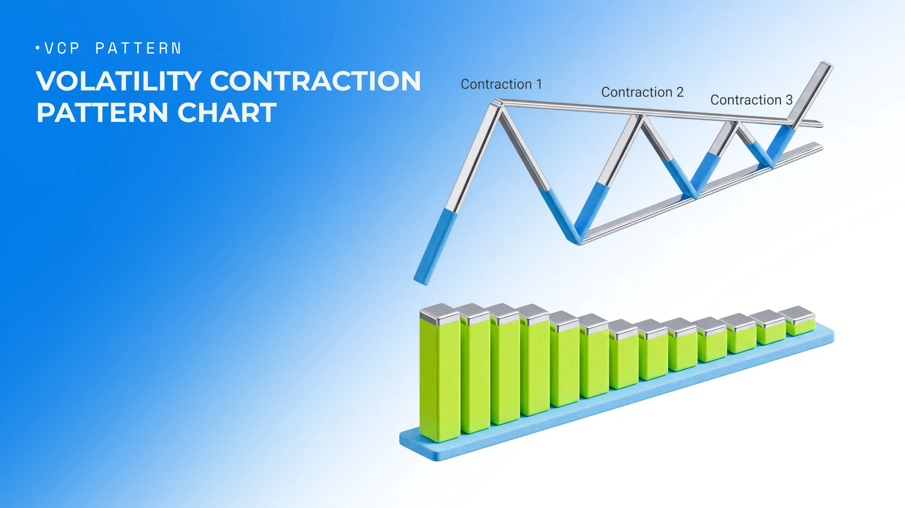
Inside a classic volatility contraction pattern, each successive price swing or pullback tends to be narrower than the one before it, so overall volatility gradually shrinks as the pattern develops. Picture a purely illustrative example: an initial pullback, followed by a second one that covers noticeably less ground, followed by a third that's tighter still.
There's no fixed number of contractions a genuine volatility contraction pattern has to show, and no universal percentage, like a 20 percent pullback followed by 10 percent then 5 percent, that every instance has to follow. What matters is the overall sequence of tightening price action, not perfect geometry.
Stage | What to Look For |
|---|---|
Contraction sequence | Progressively narrower pullbacks or price ranges, without a fixed count or percentage |
Volume behavior | Trading activity often easing as the pattern tightens, where comparable volume data exists |
Pivot | The resistance area or high point of the final, tightest contraction |
Breakout | Price moving beyond the pivot, ideally with follow-through |
Failure signs | A brief move beyond the pivot that reverses back inside the range |
None of this requires an idealized textbook diagram to actually count. What matters for reading a volatility contraction pattern is the general tightening sequence, not a perfect match to any single illustration.
Checking how a contraction sequence actually builds out on your own charts through your Pocket Option login account tends to make the shape click faster than reading about it alone.
What Smaller Pullbacks Tell You
Narrowing pullbacks offer a visual cue that volatility is easing and price behavior is shifting. A classic bullish vcp trading setup often shows higher lows, or pullbacks with shrinking depth, as the pattern develops.
None of this means any random set of higher lows automatically qualifies as a genuine pattern, or that smaller pullbacks alone prove sellers have backed off. Reading vcp trading structure well means looking at the full sequence, not cherry-picking one or two narrowing swings.
Why Volume Often Dries Up as the Pattern Tightens
Volume dry-up shows up as a characteristic feature of the classic stock-based version of this pattern: trading activity often eases alongside the tightening price action. Declining volume during a volatility contraction adds context. It doesn't, by itself, prove institutional accumulation or confirm sellers have disappeared entirely.
There's no fixed percentage decline that every volatility contraction has to hit. Whether this kind of volume read is even available depends heavily on the quality and type of volume data accessible for a given instrument, since not every market offers comparable exchange-traded volume.
Finding the Pivot Before the VCP Breakout
The pivot marks a key resistance area, typically the upper boundary of the final, tightest contraction, and it's the level a potential breakout gets measured against. Picture a purely illustrative example: after a sequence of progressively narrower contractions, price settles into a final tight range, and the high of that range becomes the pivot worth watching.
Not every local high inside a broader consolidation functions as a genuine pivot in a vcp stock pattern. There's no single universal formula for calculating the exact level either. It tends to sit at the boundary of that final, tightest range specifically.
What Counts as a Breakout From a VCP?
Price moving above the pivot counts as a potential breakout, though a brief poke above the level isn't enough on its own to conclude the move continues. A close beyond the pivot, sustained movement past it, genuine follow-through, and, where relevant volume data exists, an increase in trading activity all add weight to reading a vcp chart pattern breakout as more than a brief spike. There's no fixed threshold, like volume running 40 to 50 percent above average, that applies universally here. Specific numbers like that reflect one source's own framework, not a fixed standard every breakout has to meet.
VCP Trading: How to Read the Breakout in Context
A breakout reads better alongside the broader trend, the quality of the contraction sequence, where the pivot actually sits, and how price behaves once it clears the tight area, not in isolation. Picture two purely illustrative scenarios: one where progressively smaller contractions, easing activity, a clean breakout, and genuine follow-through all line up together, versus another where price pokes above the pivot and quickly slips back inside the range.
None of this amounts to a fixed checklist that guarantees a successful breakout once every box gets checked. Context adds weight. It doesn't remove the risk of a false signal.
When Volume Expansion Adds Confirmation
In the classic stock version of this pattern, a genuine expansion in volume during the breakout can reflect rising participation compared to the quieter contraction phase beforehand. That's additional context, not a guarantee of continuation. Applying stock-specific volume rules directly onto instruments with a different kind of volume data, or without comparable centralized exchange volume, overstates what that comparison can actually tell you.
When a VCP Breakout Fails
A handful of real warning signs are worth keeping in mind:
A brief move above the pivot that reverses back inside the contraction
No real follow-through after the initial break
A sharp expansion in volatility running against the breakout direction
The final contraction's structure breaking down before a clean breakout even happens
A conflict with the broader market context surrounding the setup
None of this makes the pattern itself a statistical guarantee of any particular outcome. It remains a visual model of price behavior. Volume confirmation, even where relevant data exists, doesn't eliminate the chance of a false breakout either.
Risk Disclaimer: Trading involves significant risk of capital loss. This article is for educational purposes only and does not constitute financial advice. Always conduct independent research and consider your risk tolerance before making any trading decisions.
See more:InterestingTrading Strategies