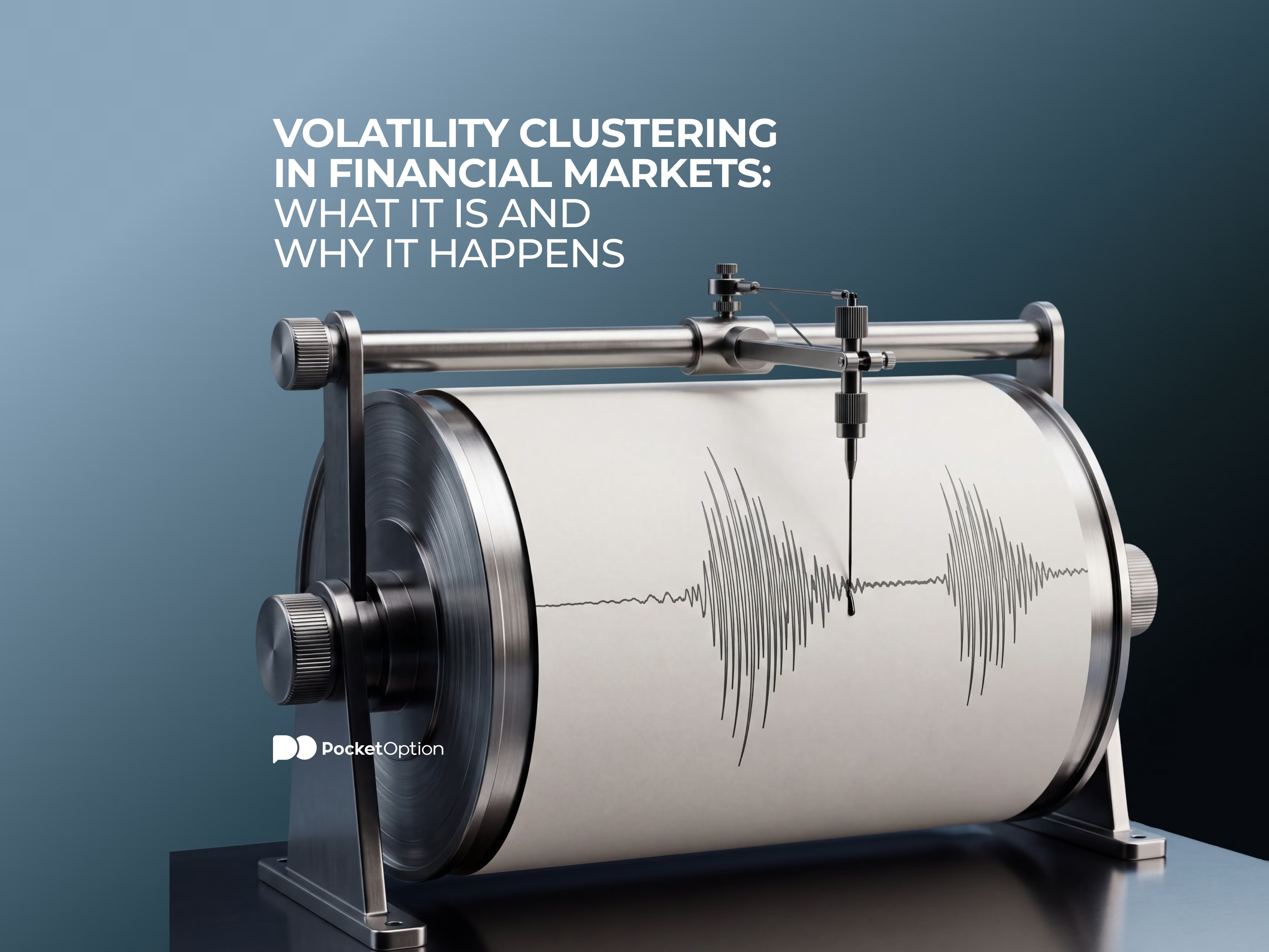
Volatility Clustering in Financial Markets: What It Is and Why It Happens
Volatility clustering describes how periods of large price changes and calm periods with small changes each tend to group together over time. This guide explains why the pattern happens, how it differs from a single volatility spike, how ARCH and GARCH models capture it, and what it means for assessing risk.

March 2020. The VIX, Wall Street's fear gauge, shot past 80. The weeks after stayed wild. Then things slowly calmed down. Nobody was surprised. Loud markets rarely go quiet overnight. Quiet ones rarely stay quiet forever. Traders have a name for that habit.
What Is Volatility Clustering in Financial Markets?
Volatility clustering in financial markets works like this. Big price changes follow big ones. Small changes follow small ones. Benoit Mandelbrot spotted it in the 1960s. He was studying cotton prices. Traders have tripped over it ever since. Weather works the same way. Storms bunch up. So do sunny spells.
One thing trips people up. It's about size, not direction. A wild week can be a falling week. Or a rising one. Or both before lunch on Wednesday. High volatility just means price moves more than usual. Not which way. Stocks do it. Currencies do it. Oil does it. Bitcoin does it. That's why volatility clustering in financial markets shows up whatever you trade.
Open a demo account and watch calm and volatile stretches unfold on a real chart.
Try Demo AccountCharts tell this story better than paragraphs do.
Scroll a EUR/CHF chart back to January 2015. One candle looks like a glitch. The weeks around it look like a different market. You don't need a history lesson to feel what a cluster is. A demo account shows you the same thing live, with virtual funds. Watch quiet turn loud. Watch loud turn quiet. No risk involved. Honestly, it's the fastest way to recognize volatility clustering in financial markets.
Next time the news gets loud, open demo trading. Just watch the candles.
How Volatility Clustering Appears on a Price Chart
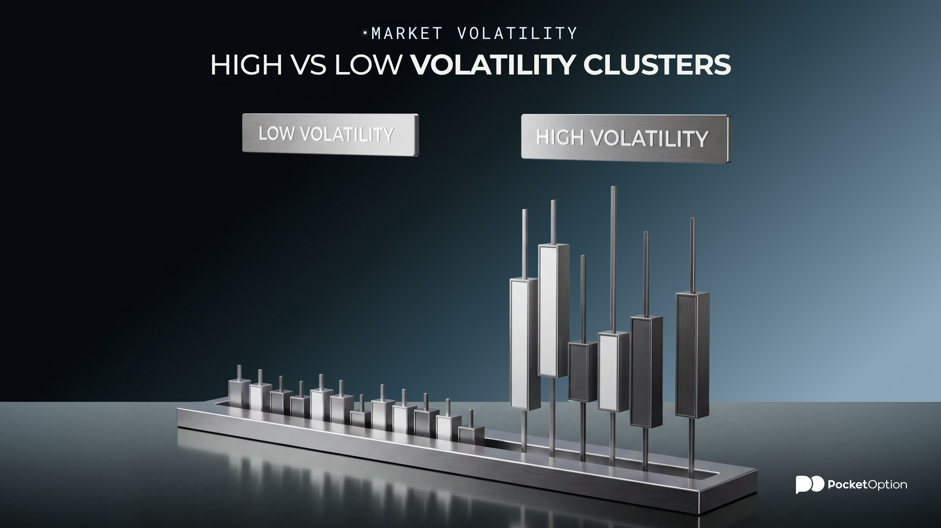
What does it look like? Quiet first. Small candles. Tight range. The kind of chart you scroll past. Then something lands. A rate decision, say, or a surprise number. Three candles cover what a day normally does. Ranges widen. Big moves keep coming. A few days or weeks later, it fades. Quiet, shock, busy stretch, slow fade. That's volatility clustering on almost any chart you open.
Can't find the tool for candle size? The pocket option tutorial shows where it hides.
And the direction? Missing from that picture, on purpose. Inside a busy stretch, price can jump up and down all day. Volatility clustering describes intensity, not bullish or bearish. Two brutal days pointing opposite ways can still be one cluster. Brexit week is a decent example. The pound lost roughly 8% against the dollar in one day. Then it kept lurching for weeks. Smaller versions happen all the time. A few jumpy sessions in a row. Then a week where nothing seems to move. Once you've seen the rhythm a few times, it stops surprising you. The market goes quiet. Gets loud. Goes quiet again.
Why Does Volatility Tend to Cluster?
So what is volatility clustering really caused by? Honestly, nobody has one clean answer. Anyone who claims otherwise is selling something. Several things stack up. Start with news. January 2015, a Thursday morning. The Swiss National Bank dropped its euro floor. Franc pairs went haywire. Spreads blew out. Over by lunch? Not even close. Traders were still repricing days later. Every reaction became the next headline. Add thin liquidity. Add jumpy expectations. Add people trading off each other's moves. One event becomes a whole busy stretch. Robert Engle's classic explanation points to clustered information arrivals. Good piece of the puzzle. Not the proven cause.
News, Uncertainty and Market Repricing
Aftershocks are a fair comparison. The first jolt isn't the whole earthquake. Same with a central-bank surprise. Analysts rewrite forecasts. Commentators argue. Funds adjust positions. Each step nudges price. So one event can power a whole busy period. Not just one jump. That explains persistence. It doesn't tell you where price goes next.
Why Calm Periods Can Persist Too
Quiet clusters exist too. No big news. Steady uncertainty. Steady activity. A market can drift in a tight range for weeks. Sometimes months. It depends on the instrument and the backdrop. Boring charts breed overconfidence, though. A quiet stretch can't tell you when the next spike starts. Ask anyone who sized up for a calm summer. Then met a loud September.
High-Volatility vs Low-Volatility Clusters
Side by side, the difference is easy to see.
Aspect | High-Volatility Cluster | Low-Volatility Cluster |
|---|---|---|
Typical price behavior | Sharp, frequent moves | Small, gradual moves |
Size of returns/candles | Larger, wider ranges | Smaller, tighter ranges |
Market uncertainty | Often elevated | Often relatively stable |
Trading conditions | Can shift quickly | Tend to feel steadier |
Risk implications | Higher near-term risk | Lower near-term risk, though not zero |
No universal threshold splits these into two fixed regimes. High or low depends on the instrument. It depends on the timeframe and its own history.
Why Volatility Clustering Matters for Risk
Why should you care? Because assuming constant volatility oversizes positions. After a turbulent stretch, elevated risk tends to linger. A long-term average can hide what's happening right now. Models that assume constant volatility miss this. They treat every day alike. Markets don't. Say you sized a position for quiet weeks. Then a shock hits. The same position swings far more than you planned. Nothing changed except the market's mood. Flip it around. A tight stop feels fine in a calm spell. Then noise chews it up once a cluster arrives.
Does that let you predict the next burst? No. It just stops you treating calm as permanent. The idea touches position sizing, stop distance and expected ranges. Only conceptually, though. It's not a formula. Not a rule to follow blindly.
How ARCH and GARCH Capture Volatility Clustering
ARCH and GARCH sound intimidating. They're models for volatility that changes over time. Robert Engle proposed ARCH in 1982. He won a Nobel for it in 2003. GARCH came later and extended the idea. The gist: today's volatility estimate leans on recent shocks. It leans on earlier volatility too. So the model remembers a shock and lets it fade slowly. That memory captures persistence and clustering.
No equations here. No parameters. No estimation methods. This isn't a modeling tutorial. These models describe and estimate how volatility behaves. They don't explain every economic reason clustering happens.
What Traders Should Notice During Volatility Clusters
No strategy here. Just habits. On its own, no item predicts the next move. Together, they give a grounded read on conditions. A quick checklist:
The recent size of price moves
Whether volatility looks like it's expanding or contracting
Market news and the uncertainty around it
Liquidity and spreads, where relevant
The timeframe being used
Whether current conditions differ from the recent historical range
Clustering helps gauge today's risk environment. It gives no reliable signal for the next price move. It won't tell you when a busy or calm regime ends. Use it as context, not a signal.
Risk Disclaimer: Trading involves significant risk of capital loss. This article is for educational purposes only and does not constitute financial advice. Always conduct independent research and consider your risk tolerance before making any trading decisions.
See more:Education