
- User-Friendly Interface: Navigate the platform effortlessly.
- Advanced Charting: Display up to 4 charts on a single screen for comprehensive analysis.
- Over 30 Indicators: Use technical tools to refine your strategies.
- Graphical Tools: Draw and annotate directly on your trading charts.
- Sentiment Indicators and Signals: Gain insights into market trends and trader behavior.
- AI Trading and Bots: Automate your trading for better efficiency and consistency.
- Wide Asset Selection: Trade over 100 assets with as little as $1 and earn up to 92% profit on short trades.
Understanding your trading equity curve—a graphical representation of your trading account's performance—provides critical insights into the effectiveness of your strategy. By analyzing this visual representation of your account balance over time, traders can identify profitable patterns, avoid emotional decision-making, and optimize their strategies. This analysis highlights periods of consistent profits and drawdowns, helping traders refine risk management, adjust position sizing, and improve overall performance.
What Is a Trading Equity Curve?
A trading equity curve is a visual tool that plots the cumulative profit or loss of your trading account over time, allowing traders to assess the long-term performance of their strategies. It is typically represented as a graph where the x-axis corresponds to time, and the y-axis denotes the account’s value.
This mathematical representation reveals performance patterns, such as consistent growth or sudden drawdowns, that might otherwise remain hidden in raw numerical data. Platforms like Pocket Option simplify this process, providing traders with advanced tools to analyze and improve their trading curves.
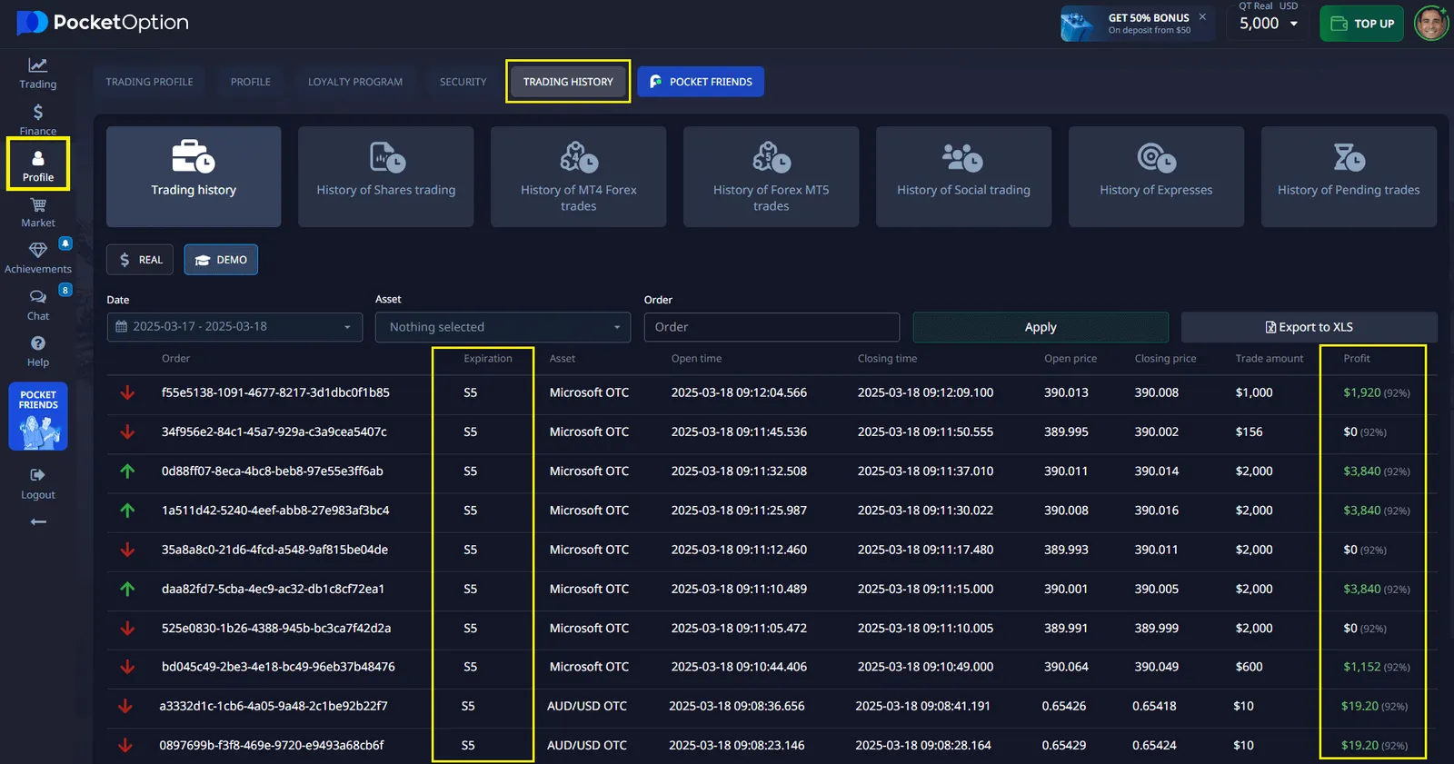
Pocket Option Trade History: A Key to Building Your Equity Curve
Pocket Option offers a dedicated “Trades” section, which plays a crucial role in constructing your trading equity curve. By analyzing your trade history—including profits, losses, and overall performance—you can monitor the growth or decline of your trading account over time. These detailed records allow you to visualize your trading effectiveness and make informed decisions to refine and improve your strategies.
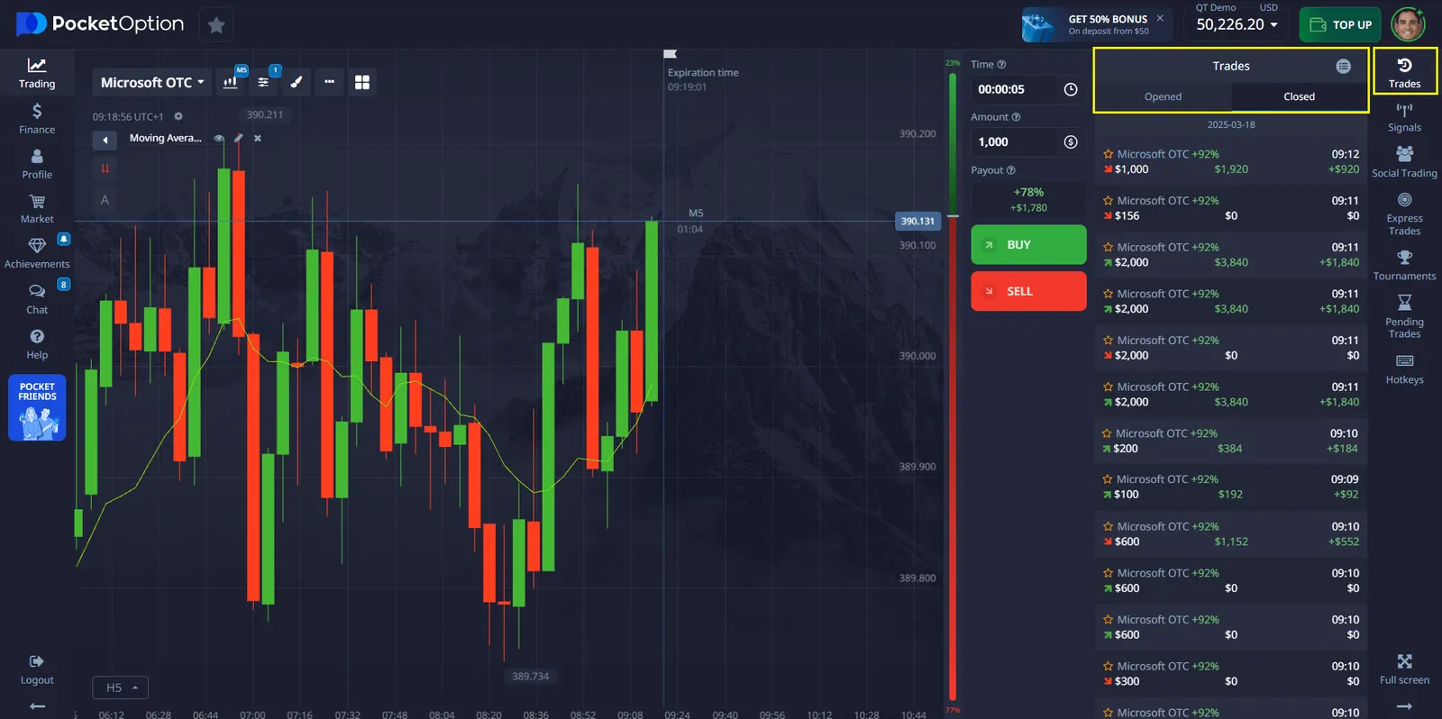
The “Trades History” section is designed to give you a clear picture of your trading habits, helping you identify successful patterns and areas for improvement. With Pocket Option, you don’t just trade—you learn and evolve with every transaction.
Advantages of Pocket Option for Equity Curve Trading
Pocket Option not only provides a seamless way to analyze your trading equity curve but also offers exclusive features designed for successful trading:
Key Metrics for Equity Curve Analysis
Key metrics like Net Profit, Win Rate, Maximum Drawdown, and Recovery Factor form the foundation of equity curve analysis. For example:
- Net Profit is calculated as the difference between your ending and starting balance. If your account started with $10,000 and ended at $12,000, your Net Profit is $2,000.
- Win Rate measures the percentage of trades that are profitable. A high win rate can reduce the psychological pressure of trading.
- Maximum Drawdown highlights the largest decline from a peak to a trough in your equity curve, showing the level of risk your strategy exposes you to.
- Recovery Factor compares your net profit to the maximum drawdown, helping you assess how effectively your strategy recovers from losses.
By utilizing the “Trades” section on Pocket Option, you can calculate these metrics easily and track your progress, ensuring that your strategies are aligned with your financial goals.
Example of a Trading Equity Curve
To better understand how a trading equity curve looks and how it is analyzed, let’s take an example. Imagine you start trading with an initial balance of $10,000. Over the course of five trades, your results were as follows:
| Trade Number | Trade Result ($) | Account Balance After Trade ($) |
|---|---|---|
| 1 | +200 | 10,200 |
| 2 | -100 | 10,100 |
| 3 | +300 | 10,400 |
| 4 | -200 | 10,200 |
| 5 | +500 | 10,700 |
After each trade, your balance changes, and this data can be plotted on a graph to visualize your trading equity curve. Such a curve illustrates how profits and losses impact the growth or decline of your account over time.
Curve Description
- Start of Trading: The balance gradually increases, indicating an initially successful strategy.
- Drawdown: The second and fourth trades result in losses, which are reflected in the downward movement of the curve.
- Recovery: The third and fifth trades show strong gains, creating an upward trend on the graph.
How to Use This Information
By analyzing the data, you can draw the following conclusions:
- Your strategy works in the long term, as there is overall growth in capital.
- However, attention should be paid to the losses in the second and fourth trades to understand whether they can be avoided or minimized.
This analysis of your trading equity curve can help you refine your strategy and make more informed decisions moving forward.
Practical Applications of Equity Curve Analysis
Analyzing your trading equity curve allows you to make data-driven adjustments, such as:
- Position Sizing: Adjust position sizes based on equity performance to maximize returns while minimizing risks.
- Strategy Selection: Identify which strategies work best in specific market conditions.
- Risk Management: Monitor drawdowns and refine risk parameters to avoid significant losses.
With Pocket Option, you can access real-time equity curve updates, over 30 technical indicators, and detailed analytics to make smarter trading decisions. Additionally, the “Trades” section provides a comprehensive breakdown of your trading activity, enabling you to pinpoint areas for improvement and build a more consistent equity curve.Maximize your performance—trade 100+ assets on Pocket Option with up to 92% profit!
Conclusion
Mastering your trading the equity curve is essential for long-term trading success. By regularly analyzing key metrics like Net Profit and Maximum Drawdown, and identifying patterns in your equity curve, you can make informed adjustments to your strategies. Platforms like Pocket Option empower traders with powerful tools, such as advanced charting, AI trading, the “Trade History” section, and real-time indicators, to optimize performance and achieve consistent results.
Don’t leave your trades to chance—embrace data-driven equity curve analysis and take your trading to the next level with Pocket Option.
FAQ
How often should I analyze my trading equity curve?
Review your equity curve at least weekly for active strategies. Monthly reviews are suitable for longer-term approaches. After significant market events, immediate analysis can help determine if your strategy requires adjustments.
Can equity curve analysis predict future performance?
While not predictive in an absolute sense, equity curve analysis reveals patterns and system characteristics that may continue under similar market conditions. It's more accurate to view it as a diagnostic tool rather than a predictive one.
What's the difference between nominal and percentage equity curves?
Nominal curves show absolute dollar values, while percentage curves show relative changes from a starting point. Percentage curves are better for comparing different strategies or accounts with varying capital sizes.
How can I smooth out a volatile equity curve?
Implement tighter risk management, increase trade frequency (if strategy allows), diversify across markets, or use correlation filters to avoid similar trades. Position sizing based on volatility can also help stabilize returns.
Is a perfectly straight equity curve realistic?
No. Even the best trading systems experience periods of drawdown and volatility. A too-perfect curve in backtesting often indicates curve-fitting or other methodological errors that won't translate to live trading.